
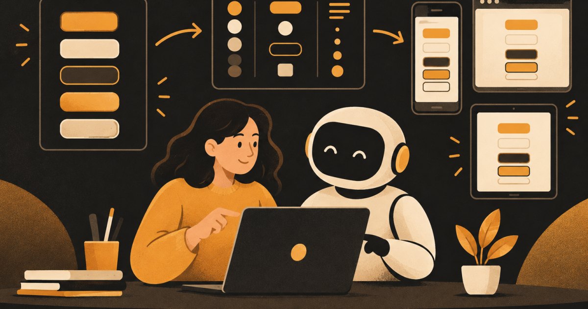
This post is for people already shipping apps with Claude. You have a few screens live, and you have started to notice it: three shades of gray that are almost the same, buttons with different corner radiuses, a heading size that only exists on one page. Each screen looked fine when Claude built it. Together they look like four different apps. The fix is a small design system, defined once and turned into tokens Claude has to use.
Why the drift happens
When Claude builds a screen from a screenshot, it estimates colors and sizes from pixels. Ask it for a new screen next week and it estimates again. Slightly different blue, slightly different padding. Nothing is broken, so nobody fixes it, and it compounds.
Tokens stop the guessing. A token is a named value, like --color-primary or --space-4. Once those names exist in your code and Claude knows it must use them, a new screen cannot invent a new blue without breaking an obvious rule.
Keep the system small
You do not need a hundred-component library. For a typical SaaS app, this covers most of it:
- Colors by role, not by name: primary, primary hover, background, surface (cards), border, text, muted text, success, warning, danger. About ten.
- Type scale: five or six sizes (small, body, large, h3, h2, h1), one or two font families, two or three weights.
- Spacing scale: one set of steps, such as 4, 8, 12, 16, 24, 32, 48 pixels. Every margin and padding uses one of these.
- Radius and shadow: two or three of each.
- Core components: button (primary, secondary, danger), input, select, card, table row, badge, modal, empty state.
If a value is not in the list, it does not go in the app. That one rule does most of the work.
Build it in UX Pilot
UX Pilot's design system feature lets you start from a text description, a website URL, a Figma file (in beta), a GitHub repository, a local codebase or uploaded files. It keeps the tokens and usage guidance in a DESIGN.md file that its AI follows when it generates new screens, and it can check new designs against the system for consistency.
If you already have a live app, starting from your URL or repo is useful because it shows you what you actually have, including the three grays. Then clean it up. If you are starting fresh, describe it:
Design system for a B2B SaaS dashboard.
Calm and practical, not playful.
Primary color: deep blue. One neutral gray scale.
Success green, warning amber, danger red.
Font: Inter. Body 16px. Compact but readable spacing on
a 4px base. Medium rounded corners on buttons and cards.
Components: buttons (primary, secondary, danger), text input,
select, card, table, badge, modal, empty state.
Review what it generates and cut anything you will not use. Then generate one or two real screens from your app with the system turned on, to check that the tokens hold up on actual content and not just a sample sheet.
Turn it into tokens in your code
Bring the final values from UX Pilot into your repo as one file. Plain CSS custom properties work with any stack:
/* src/styles/tokens.css */
:root {
  --color-primary: #1f4fd8;
  --color-primary-hover: #183fae;
  --color-bg: #f7f8fa;
  --color-surface: #ffffff;
  --color-border: #e3e6eb;
  --color-text: #161a22;
  --color-text-muted: #5b6472;
  --color-success: #1a7f4b;
  --color-warning: #b26a00;
  --color-danger: #c62f2f;

  --font-sans: "Inter", system-ui, sans-serif;
  --text-sm: 14px;
  --text-base: 16px;
  --text-lg: 18px;
  --text-h3: 20px;
  --text-h2: 24px;
  --text-h1: 30px;

  --space-1: 4px;
  --space-2: 8px;
  --space-3: 12px;
  --space-4: 16px;
  --space-6: 24px;
  --space-8: 32px;
  --space-12: 48px;

  --radius-sm: 4px;
  --radius-md: 8px;
  --shadow-card: 0 1px 2px rgba(0, 0, 0, 0.06);
}
Those values are an example. Use yours. If your project uses Tailwind, ask Claude to map these variables into your Tailwind theme so classes like bg-primary point at the token instead of a raw hex value. Ask it to check which Tailwind version the project uses first, since the config approach differs between versions.
Also copy the usage guidance from your DESIGN.md into the repo next to the tokens (for example design/DESIGN.md). Rules like "only one primary button per screen" are part of the system too, and Claude can read them.
Make Claude follow them
In Claude Code, the CLAUDE.md file loads into every session. Anthropic's best practices recommend keeping it short and limited to things Claude cannot work out from the code. A few lines are enough:
# Design system
- All colors, font sizes, spacing, radius and shadows come
  from src/styles/tokens.css. Never hardcode hex values or
  pixel sizes in components.
- Use the shared components in src/components/ui/ before
  creating new ones. Ask before adding a new component.
- Usage rules are in design/DESIGN.md. Read it before
  building a new screen.
In claude.ai chat, do the same with a Project: add the tokens file and DESIGN.md to the project files and put the three rules in the project instructions. Every chat in that project starts with them.
Instructions work most of the time, not every time. So add a check Claude can run. A simple one is a search for raw hex values outside the tokens file:
Search src/ for hardcoded hex colors and pixel values in
component files (anything outside src/styles/tokens.css).
List each one with file and line, and which token it should
use. Don't change anything yet.
Clean up the drift you already have
Run that search on your live app first. You will likely find dozens of near duplicates. Fix them in small batches, one area of the app at a time, and look at each area after the change. Replacing every gray at once can shift contrast in places you did not expect.
Replace the hardcoded values in src/components/billing/
with the matching tokens from src/styles/tokens.css.
Where a value has no exact match, use the nearest token
and list those cases for me to review.
Show me before and after screenshots of the billing page.
Adding new screens from here
The loop for every new screen:
- Generate it in UX Pilot with your design system applied.
- Export the image and write a short screen spec.
- Ask Claude to build it using only existing tokens and components, and to tell you if the design needs something the system does not have.
- Compare the result to the design before you move on.
That third point is the useful one. When a design needs a new component, you want to make that decision on purpose, add it to the system in UX Pilot and to your code, and not have Claude quietly invent a one-off.
When you change the system
Change the token in UX Pilot, then change the same token in tokens.css. Because components reference the name and not the value, a new primary blue updates everywhere at once. That is the payoff for the setup work.
Be honest about scale. If your app is three screens, a tokens file and a five-line rule in CLAUDE.md may be all you need, without a formal design system at all. The UX Pilot side earns its place when you are adding screens regularly or working with someone else.
Where to go next
The recipes at /recipes include build specs you can drop your tokens into. If you are shipping and want a second set of eyes on your app's consistency, bring it to a cohort at /cohorts.
What would have made it better?